I think that I've learnt a lot about having to plan what I wanted to do. If I hadn't thought and researched on things such as colour scheme or where the text would go, it wouldn't have looked like a good or realistic magazine.
I've learnt what images look best, as well as what my magazine should include, instead of just making things up as I go along.
Wednesday, April 27, 2011
6. What have you learnt about technologies from the process of constructing this product?
Throughout the process of constructing my media product I've learnt a lot of new techniques on the computer, which have all helped me throughout constructing my whole media project.
I've learnt how to use a lot more of the applications, and will now use them a lot more frequently with other work I have. Microsoft office publisher was one of these applications. I used this application in producing my double page spread of my media product.
While working through my front cover and contents page, I wanted to change how some of the writing looked, and learned about the application 'wordart', which changes the shapes and colours of your text.
The last thing i learnt through constructing my media product was how to 'print screen' an image, paste it onto "Paint", crop it and (which I also learned to do) and then save it as a new picture that I could then put on my blog, shown as either research or an image I had already created.
5. How did you attract/address your audience?
I attracted my audience in a lot of ways, I tried to use as bold and eye-catching colours as possible, without making my coursework tacky. I tried to use the right images, to make the reader want to take a look. I also researched a lot of what a typical music front cover would have on it, such as something to win and so on. I tried to make my magazine fun, as well as informative, as when I looked up music magazines on the Internet, they all seemed dark and depressing, when I wanted mine colourful and intriguing.
4. Who would be the audience for your media product?
I think I have a wide audience for my music magazine, contents page and double-page spread.
I tried as best as I could to make my magazine for both genders, so included blues, as well as pinks. I also looked at music magazines made ideally for women, and then for men, and tried to make mine so both sex's would want to read it as in the things I had for people to win, such as the iTunes voucher, which would appeal to everyone.
I don't think there is a specific age on who the audience of my music product really, but if I had to put an age on it, I would say for both males and females aged around fourteen to twenty. I would say this as I wouldn't see anybody older than around twenty, really being interested in a magazine of mine. The language used isn't basic, but isn't of much intellect either, so could be read as boring and un-interesting. I also asked a few people around the ages of twenty five to thirty five if they knew who Lady Gaga was, as my image for my front cover looks a bit like her, to which five out of twelve didn't know who she was. This is another reason why I believe there is a specific age for my magazine also.
2. How does your media product represent particular social groups?
I think that my product represents the media group "Chart music" as in music that is new out and played on the radio and television often, and is included in the top 40 chart list. I believe this because I include a lot about artists that are in this music chart such as Lady Gaga.
1. In what ways does your media produce use, develop or challenge forms and conventions of real media products?
My media product is all based on what you would typically find in the music industry. I researched a lot for my work on my front cover, my contents page as well as my double page spread to make sure it didn't just look like a students work, it looked like what you would find on a shelf in a shop.
I used images you would typically find in a magazine, and that is why for my front cover, i got a friend of mine that looks similar to Lady Gaga, to be my front cover image, as Lady Gaga is in the chart music part of the music industry and this is the genre I decided to base my magazine on.
Most music magazines are usually dark, and dim, and in reds, blacks and whites, while mine is all the brightest colours you can get. I did this as I thought it would be a lot brighter and eye-catching to the typical music magazine reader. It would be something different and because of this, it would stand out more.
My front cover and double page spread are basically the same set-up as what you would find in a music magazine, the front cover has writing on both sides of the page, a large image with text written over it, a date, an issue number and a price. My double page spread is an interview, which when I researched, is mainly all I found double page spreads contained. I used around the same amount of images as a typical double page spread would have in it, as well as similar questions and colours for the text.
Friday, April 8, 2011
Finished double page spread

This is my final double page spread of my music magazine. I took the pictures myself, and edited them to fit best.
I researched a lot on double page spreads on search engines such as google, to see what double page spreads usually contained. I also asked other people on the course what they would include and they also said that they were doing interviews.
I researched what questions would usually be asked, and answered, and the length of questions and answers also. I thought that seeing as I was doing a music magazine, that i would do an interview about a singer, and seeing as my front cover included my friend named Lauren, I would do my double page spread about her too, so I named her "Ladee Laur" and made up that she had just brought a single out.
I thought a lot about my colour scheme, and finally decided on a black back round with pink, purple and white writing. This might make it look like it's aimed more towards females, which was not it's intention, I just thought it looked better.
This probably took the most time to do within my whole media product as I wasn't totally familiar with the application "publisher" and my work didn't go as I wanted it to. In the end I learnt how to use publisher, as well as to save my image as a "jpeg" so I could place it onto my blog.
Over all I'm really happy with my double page spread, I put a lot of effort into it, and think it has turned out well, I wouldn't change anything about it, except for maybe changing the pinks for blue, or more masculine colours.
Wednesday, April 6, 2011
Final contents page of my music magazine

This is my final contents page. I've changed a lot on it that I wasn't happy about, and now I'm a lot happier with my end result. I've added an extra picture of a friend of mine, as I thought it would fit in well with my contents page.
My contents page is a lot different to my front cover though. It's a lot darker than my front cover, as I thought it would make the writing and images stand out more, but didn't want my whole coursework to be dark. I've removed the back round image as when i thought about it, it made my contents page look tacky and didn't go well with the text I had over it.
I've changed some of the colours of things such as the "features and regulars" as there was a lot of pink on my contents page before, and could look like it was aimed more towards women.
I've kept the stars on my contents page, much the same to my front cover, as I thought that they would look good on both my front cover as well as my contents page. Over all I'm very happy with how my contents page has turned out, and wouldn't change anything about it, except for maybe some more text, or smaller images, but I think as it stands, in my opinion it looks fine.
Thursday, March 31, 2011
Finished front cover for my Music Magazine

This is my final front cover of my music magazine "Music Juice". I've changed a lot on this, I've changed the fonts of most of the page, such as the website at the bottom of the page was originally "Tahoma" and is now "Broadway". I've also added more text that would be typical in a music magazine off the shelf, such as "Win a £50 iTunes voucher, details inside!"
I've also added a price, next to the bar code, in both pound sterling, as well as in the euro, which i went on the Internet to make sure I got the right exchange price.
I've changed the colours as well, such as the blue circle on the mid-right hand side was originally a darker blue. I noticed that my colour schemes were all over the place, such as different blues being used, so i changed that, and now all the blues are the same.
I've also changed some of the information, as before, I had information on my cover that didn't apply to my contents page, like it should do.
Over-all I am really happy with my final front cover. I think I've used a lot of bright and eye-catching colour, which would instantaneously make somebody want to pick it up and read it. I think my image is good also, as it has a white back round as well as white above her head which I did purposely for the header to be put there. I've put borders around only some of the writing, where I think it would stand out more and look better, rather than outlines on everything.
More work on my front cover for my Music Magazine
 This is an almost finish front cover for my music magazine. I've added a lot of colour to this, as I think the brighter the front cover, the more interested a person would be to reading it. I've researched a lot of music front covers, and I found that on the left hand side, there was always a larger set of writing, followed by smaller. I also noticed that a lot of them had their website link at the bottom of the page which I have included. It's not very bold and easy to see though, so I'll either change the colour, or put a back round colour behind it. I've also included the basic things such as a bar code as well as the date. There's still a lot more I want to do to this front cover, maybe add another smaller image, change some of the colour schemes and so on.
This is my front cover with a bit more work on, I've now added a back round colour to my website at the bottom, as well as numbers on top of my bar code. I have also put a "win a free CD" on the top left corner, as well as moved the date onto the right hand side of my cover, instead of keeping it on the left.
I thought that adding the stars above my image's head would also look good, as stars seem to be a popular symbol at the moment, with lots of music magazines having them, as well as people having tattoo's of stars and shapes shaven into their heads.
I know more writing needs to be put on my front cover, so I will research a lot more magazines from shops and the internet, and get some ideas on what I can put on it. I know I have a lot of fonts, sizes and colours on my cover, which rather than being eye-catching, could just be confusing, so I will change this by the time I am finished.
Tuesday, March 22, 2011
An almost finished contents page
 I decided to go for a completely different colour scheme, to see how it would look rather than having a black back round. I've also deleted a lot of the writing i originally had on my contents page, as I thought it was unnecessary and a waste of valuable space. I've moved the "features" and "regulars" around on the page to see what that would look like too. I've also changed some of the colours of some things such as the "Win" box at the bottom of my contents page.
  Although I have made a lot of changes to my contents page, I'm still not happy with it, and still feel this doesn't look like a typical realistic contents page. I think that if I change some of the colours around more, as well as where the information is put on the page I will be happy with it. I'm still not entirely sure about having a blue back round either, so I think I might change it back to a black back round again.
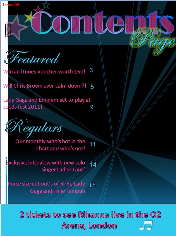 I've changed my back round back to black again, as having feedback from other people, as well as my personal opinion, it in fact made my contents page look tacky, rather than eye-catching. The image to the right, is an almost finished contents page, all except for images and maybe some colour changes, as well as font changes, as I have many different font schemes going on, all on one page.
I think that possibly deleting the back round image I have on my contents page now would make it look better as Ive changed the colour of it many times and i am still un-happy with it.
Tuesday, March 15, 2011
More work on my entire Music Magazine
 I took this picture myself of my friend, Lauren. I decided I wanted her to look a little bit like Lady Gaga, seeing as I'm doing a music magazine, but didn't want her to look exactly like her. This is why I've let her leave her hair straight, but still have the well-known black triangles under and on top of her eyes. I've decided I want this image for my front cover of my music magazine. This means I can have her on my double-page spread as a singer named "Ladee Laur".
The make up I have done myself, as well as changing her nail polish colour, as originally, it was all chipped. I think that this is a good image to have for my front cover, as images similar to this, are what is usually on a typical music cover. I might take more pictures and see if I can have a better image for my front cover, but at the moment I am happy with having this one.
I might also change the hair colour of this image, or maybe take another picture of a different friend all together and see if i prefer my alternative, but at the moment, I am happy with this.
Monday, March 7, 2011
Research for my double page spread of my Music Magazine

When I researched on google images, "music magazine double-page spreads", i got a lot of different ideas. As the "Black Eyed Peas" are a well known band in the chart music industry, I thought it would be a good idea looking at a double page spread about them, and seeing what these spreads typically include. When I this double page spread, image shown to the left, I saw that it was a general interview with the band. There was also a large image taking up a lot of the space, as well as writing actually over the image. There is also larger fonts in places that are quotes from the interview also. These are all ideas I will take into consideration when doing my double-page spread. I will get a number of images, and have a play around on my page to see how they fit and how good and realistic to a real music double page spread they look.
 I also looked at a double page spread including solo artist and fashion designer Lily Allen. I thought the idea of having her quoting "People think I'm an attention seeker, but I'm just honest" looked really good in the look of words all put together, cut out of a newspaper. I also like the image, as it's the first thing you see when you look at this double page spread, so you instantaneously know who the article is about.
Much the same to The Black Eyed Peas double page spread, this is also an interview with Lily Allen. This has made me decide to have an interview with my fiction singer, "Ladee Laur" on my double page spread too.
Wednesday, March 2, 2011
The start of my Music Magazine's contents page
 This is the start of my Contents page for my Music Magazine, I've chosen a darker back round as I think it emphasises the other colours on the page more. I need to collect some more research as well as images for my contents page. When looking at contents pages on the Internet, I have found that they all contain a lot of colour. This is what I want mine to be like. I thought the heading had to be the largest part of the page obviously, as well as bright, which I have done. I've also researched the music chart's for this week (28th February) and listed the first top 5 this week, as on researching a lot, I found that many contents pages has this. I've also added a little introduction, as looking at even everyday magazine's, they all had this.
 This is the second and more on the way to being finished part of my Contents Page for my Music Magazine. I think I might have too many colours going on, as usual colour schemes only have a maximum of 4 or 5 colours on a page. I also think I might have a bit too much writing on this too, so I should cut down and just put the most relevant information on my Contents Page. I've already cut down my introduction substantially, but there's a lot more to be done. I'm thinking about getting rid of the top 5 charts from this week as it takes up a lot of room and could usually be found further on in the magazine. I'm also thinking about maybe getting rid of the back round graphics all together, as I don't know whether it's just making my contents page too crowded rather than doing any good.
 I think that I will defiantly remove the top 5 music chart from the right side of my contents magazine all together. Although it could have been a good idea to start with, I've had feedback off both my teacher and other friends on the course, and they have all said it takes up unnecessary room, where you could find the top 5 charts further on in the magazine, which would make you want to buy it. I've still got too much writing, and still too many colours, such as dark blues and light blues, which i will all change nearer the end to my finished product.
Friday, February 25, 2011
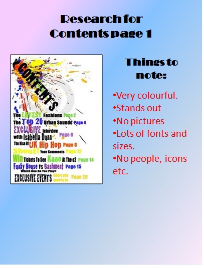
Research for my contents page on my music magazine
For doing the contents page of my music magazine, I thought that by researching everyday magazine's could be as much help as music magazine's. I have collected images from magazine's about Real life and celebrities, and this magazine is called "Love it". Both of the images were the first page before the contents page, and after the front cover. It's a page just for advertising. The advertising doesn't connect with the magazine in any way, so maybe when I look through a more variety of magazine's, such as celebrity magazines like "Heat" and "Hello" they might give me a few more idea's too. The images are both different though, the one on the left is about cooking, while the one on the right is about a hair product. I will get a lot more research that is more relevant to my music magazine, obviously through music magazine's but I just thought these images were nothing more than just idea's.


In setting out your contents page, I have noticed that the text is always the same colour, size, and font. The headings are always larger and bolder, and the page numbers are always a different colour to the writing next to it, which is obviously so it is easier to read. Also I have noticed that certain page numbers with the more interesting information are larger, as well as some having images connecting to the page next to it. I have also noticed there are little "snip bits" next to the sub headings about what is on that page which would interest a reader.
These are all things I need to take into consideration in doing my contents pages.
These are all things I need to take into consideration in doing my contents pages.
Wednesday, February 16, 2011
Research on my Music Magazine front cover
For the front cover of my Music magazine, the Image is the most important. I am getting a few friends together for poses copying some of celebrities most well known poses, and this is why I am getting a few images of celebrities together. The celebrities I have chosen all have their own "look" uniquely, and this is why I have chosen them.
 I have chosen this image of Katy Perry as she is known for this pose, and is well known in the Media and Charts, so I thought this could also be a good alternative. I like the idea of her covered in flowers, as my Music Magazine could be a Spring or Summer issue, and flowers resemble that time of year. The cover is pink, which could be seen as a colour leaned towards a certain gender, so I won't go for an all pink cover. I need to do a lot more research on colour schemes and texts for my Music Magazine.
 I also chose this other image of Katy Perry as this is also a very well known pose of hers. I'm thinking about either using Katy Perry, or possibly Lady Gaga, depends which pose works best with the friends i'm using for my images. I like this image of Katy Perry, but I don't know if the image would go well with a music magazine or not. I need to do a lot more research, and get a lot of pictures of friends in different poses and positions, to see which looks best.
Friday, January 28, 2011
The start of my Music Magazine
For the start of my Music Magazine, I've started to brainstorm on idea's for my images, as I really want to think about them so they look like a proper magazine. I initially think I may take a picture of a friend, and try to dress her up as Lady Gaga, as my chosen criteria for my Music Magazine is Chart Music. I want to think thoroughly about the name of my magazine, doing research on the Internet on names and so on.
 I've initially started my music magazine with the name "Music Juice", I thought of this, as obviously it's a music magazine (Music), and the Juice resembles general gossip, as in when somebody refers to something as"Juicy gossip".
I have started my magazine with a multicoloured back round, as I believe this is the most eye-catching and appealing cover you can see in the Media today. On researching other magazines, they all have a big image and some sort of colour on the back round, but I wanted mine to be different. If it still looks wrong when I've done more work on it, it can be easily changed.
The front cover is obviously the most important part of the magazine, and so I want to make it look as appealing and intriguing as possible. That means I need to do a lot more work to it, as looking upon it, it doesn't look like a lot of time or effort has gone into it. When looking upon other images, which you will see in my research, the image is always the largest and most important part of the front cover. It's the most appealing thing to the cover in my opinion, so I will take quite a few pictures and see how they fit in.
I also think that I need to research a lot more images, as well as information, as music magazines don't totally contain information on just music, other things are included such as Real life stories, as well as general gossip about celebrities which is within the magazine itself.
Wednesday, January 19, 2011
Final contents page of my College Magazine

On looking upon more contents pages, mainly on the internet, I found that it was mainly the same font used, which is exactly what I've done. I've changed the colour of my text, and added more, useful information to it.
In my last contents page, I had information like "A map of the Isle of Man College inside" which, honestly wouldn't be needed, there's enough signs around the premises so you wouldn't get lost, so I changed that and added information more relevant to the magazine.
I've made the charity's information a lot larger, as it would probably be the first thing you see in my contents page, which is to me, the most important. I've changed the page numbers to have a larger range, and i've added more headings like I said I would before.
As my final draft, I've changed my Contents page a lot. I've added a picture, and a lot more brighter writing. Unlike my front cover, my contents page is all in the same font, which is Broadway. I researched a lot of contents pages, and found that many of the best one's looked more professional, and realistic in the same font, so that's why mine's all the same.
I have also put stars on my Contents page now as well, as I was firstly going to call my magazine, "Student life", but ended up with "The College Star".
I've not put lots of writing on my contents page, as I don't personally read the whole contents when reading a magazine myself. I think if I had, had the oppourtunity, I'd have taken more pictures of possibly the campus, and put those on my contents page as well.
I think as my final contents page, in my opinion, it's vastly improved, and I believe this would look like something you would find in a magazine. My image doesn't stand out like a sore thumb anymore either, as I've put text above the person in the picture's head, which makes it blend in more, along with the other text. I believe my final contents page to be more eye-catching, more relevant and much more like a contents page, rather than text just dotted around the page in a mess. I'm happy that this is my final contents page.
Wednesday, January 12, 2011
My final front cover of my College magazine

This is my final front cover for my College magazine. I've changed quite a few things about it, while at the same time, keeping some things the same. I've changed the date, as realistically, a weekly magazine wouldn't be read and have as much information in, as a montly issue.
I've changed my colour scheme quite a lot, as I noticed my last magazine had a lot of pink's and red's which could be more leaned at the female gender more than the male. I also changed the Win an Ipod Nano's layout, as I thought I should take advantage of the person in the picture wearing a dark T-shirt, meaning I can have a lot of bright colours on top. I've got mainly the same fonts for my front cover, as I thought having the only different fonts for contact information, and charities was more noticeable.
I chose to use pink to talk about the charity Breast Cancer, as Breast Cancer awareness is all pink themed, so I thought that was appropriate also.
I have also decided to change the name of my magazine, as I thought from the start it was although original, not very imaginive, and it was lazy of me to just deal with the first thing that came to mind. I thought "The College Star" as a name was good for many reasons. It's slightly associated with the famous newspaper "The Star" and so instantly, you would know by the name, it had something to do with media, even if it was just a College magazine. I also added stars onto my front page, as well as my contents, as they obviously apply to my name. I've made the writing larger as well, as some information was hard to read, and would have been ignored otherwise. I've changed the layout of little things, such as the price, was originally on the left, now it's on the right side. This little tweeking, in my opinion, makes my magazine all the better, and I'm confident it's a good front cover, even though over all it's only a practice.
Research, and more work on my College contents page.

This is the start to my first go at my contents page. I used bold writing to attract people's eye as the reader. I need to possibly add some more writing, some more colours and some more fonts for more effect, I need to put some pictures onto it as well. I might remove the outline on the boxes, and change more things around until I am happy with it.

I think I need to make a lot more changes to this contents page, I took the backround colour off it, as I thought it could make it look better, when actually it didn't.
On researching other magazine contents pages, I saw they were set out a lot differently than mine. Mine contains a lot of colour, but It doesn't look as if it goes together. The picture looks like it's just been put in the wrong place and the writing seems to be all over the place. I think that when I change this again, I'll have a backround colour, and i'll probably add more text in it. I still believe a lot more work needs to be done.
Even though this still has a lot more work needed on it, I think I have improved a lot since my first draft of my contents page. I have now put an image on it, even if it doesn't look quite right yet, as well as adding more information.

I've put a backround colour onto this, as I thought it made everything piece together more. The information on my contents page, is containing things that are usually found in contents pages of magazines etc, from looking through other contents pages on the internet. I've also done some personal research of magazines, and my contents page doesn't really look like what you would find in a magazine off the shelf.
I've also made my font a little larger, as before it could have been harder to read. I believe having a backround colour on my contents magazine makes the writing easier to see and read also.
My information, although relevant, looks as if it's just thrown onto the page, so I need to change that. I also think more headings, and possibly more images would look great too. I've used a lot of colour in my contents page, as through personal research, contents pages are always bright and eye-catching. I will do some more adjustments to this, and also do something to the picture, as it doesn't look as if it should be there.
My second front cover of my College Magazine.

This is my second try at my College Magazine. I still have the same name, as it may not be the most imaginative name, but it's almost fulfilling the pun "it does what it says on the tin". .
I added a lot more bright colours to this magazine, unlike the other one, so it was more noticable for the reader. I added a lot of things I noticed many magazines included, for example, things to do with charities, I also added things the reader could win, as I saw almost every magazine included things to be won in them.
I still need to change a lot still on this, I should be able to take advantage of the person in the picture wearing a black T-shirt, meaning I can put a lot of bright writing on my front cover. I also need to change some of the grammer, the date, and some of the information included. I've decided to have many fonts on this front cover, as I gathered from research, most magazines have many fonts also.
Research on my College magazine.

To the left is some of my research from google images, for doing both of my College magazines, this helped me get different ideas on fonts, colours and information. I searched for the first image by typing in the Google search engine, magazine covers. In this cover, there is a lot of text, which is possibly an idea for me, there's also a certain colour scheme in this as well, as in black, blue and yellow, which is something else to take into consideration. I like this as a magazine cover, but this wouldn't be how I'd do it myself. In my opinion, I think there's too much text, and the image doesn't look as if it quite fits in.

For my second piece of research for my magazine, I noticed my College Magazine was obviously for College students, as in, fifteen to twenty five year old's, so I thought I would research Teen magazines. I thought this would help me a lot with ideas on my magazines, both my music magazine as well as my College magazine. This as a cover is quite plain if you look into it properly. It has little text, but it's different sizes, which gives the look of there being a lot. There's not much of a colour scheme used on this front cover, there's pinks, blacks, red and white etc. The image on this cover although, looks like it's placed properly, with the text on top of it. This cover is very bright, and seems to be set in a Summer kind of setting, which should be thought about when doing my cover at what time of year I'd like to have it in. These should all be taken into consideration while doing my cover.

This is a screenshot of my research from my power point. I chose a selection of different magazines as the College Magazine was meant to be for both males and females, so I researched for both genders. I did this so I could get an idea on colour schemes I can use that are unisex, and have information in my magazine that would appeal to both genders. The information next to each picture should explain more.
On personal research I also found that just because you have a male on the cover, it doesn't necessarily mean it's a magazine for men. Things that need to be considered while doing my magazine though is colour schemes, as all magazine's seem to have some sort of colour scheme. I also need to think about my grammar, and how my magazine seems to come across, as I wouldn't want my magazine ideal for nine year old little girls, when it's meant for roughly eighteen year old adults. I also need to think how many images I will have on my cover, and whether they fit in or not. I believe the image on the front is the most important, as it almost straight away describes what the magazine entitles.
I wouldn't personally have this as my own contents page, but I still think it's a simple, but good idea.
 I found this image also on the internet, under the search "Simple College contents pages". I don't think this is a very good magazine, as a personal judgement, as It doesn't look very imaginitive or put together. There is an image on this though, and It looks as if it's just a typical college student. There's a lot of writing that will probably not all be read, but the information is useful though. I don't see this as a very appealing contents page, as It didn't really appeal to me. I just think it's a very basic college cover, but in their defence, College magazines arn't supposed to be exactly professional.
Subscribe to:
Comments (Atom)