Friday, April 8, 2011

Finished double page spread


This is my final double page spread of my music magazine. I took the pictures myself, and edited them to fit best.

I researched a lot on double page spreads on search engines such as google, to see what double page spreads usually contained. I also asked other people on the course what they would include and they also said that they were doing interviews.

I researched what questions would usually be asked, and answered, and the length of questions and answers also. I thought that seeing as I was doing a music magazine, that i would do an interview about a singer, and seeing as my front cover included my friend named Lauren, I would do my double page spread about her too, so I named her "Ladee Laur" and made up that she had just brought a single out.

I thought a lot about my colour scheme, and finally decided on a black back round with pink, purple and white writing. This might make it look like it's aimed more towards females, which was not it's intention, I just thought it looked better.

This probably took the most time to do within my whole media product as I wasn't totally familiar with the application "publisher" and my work didn't go as I wanted it to. In the end I learnt how to use publisher, as well as to save my image as a "jpeg" so I could place it onto my blog.

Over all I'm really happy with my double page spread, I put a lot of effort into it, and think it has turned out well, I wouldn't change anything about it, except for maybe changing the pinks for blue, or more masculine colours.


Wednesday, April 6, 2011

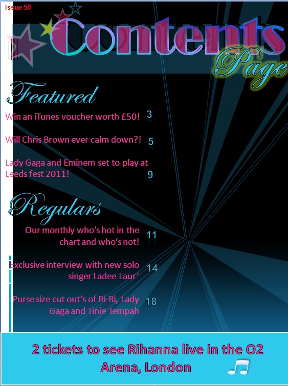
Final contents page of my music magazine


This is my final contents page. I've changed a lot on it that I wasn't happy about, and now I'm a lot happier with my end result. I've added an extra picture of a friend of mine, as I thought it would fit in well with my contents page.

My contents page is a lot different to my front cover though. It's a lot darker than my front cover, as I thought it would make the writing and images stand out more, but didn't want my whole coursework to be dark. I've removed the back round image as when i thought about it, it made my contents page look tacky and didn't go well with the text I had over it.

I've changed some of the colours of things such as the "features and regulars" as there was a lot of pink on my contents page before, and could look like it was aimed more towards women.

I've kept the stars on my contents page, much the same to my front cover, as I thought that they would look good on both my front cover as well as my contents page. Over all I'm very happy with how my contents page has turned out, and wouldn't change anything about it, except for maybe some more text, or smaller images, but I think as it stands, in my opinion it looks fine.

Thursday, March 31, 2011

Finished front cover for my Music Magazine


This is my final front cover of my music magazine "Music Juice". I've changed a lot on this, I've changed the fonts of most of the page, such as the website at the bottom of the page was originally "Tahoma" and is now "Broadway". I've also added more text that would be typical in a music magazine off the shelf, such as "Win a £50 iTunes voucher, details inside!"

I've also added a price, next to the bar code, in both pound sterling, as well as in the euro, which i went on the Internet to make sure I got the right exchange price.

I've changed the colours as well, such as the blue circle on the mid-right hand side was originally a darker blue. I noticed that my colour schemes were all over the place, such as different blues being used, so i changed that, and now all the blues are the same.

I've also changed some of the information, as before, I had information on my cover that didn't apply to my contents page, like it should do.

Over-all I am really happy with my final front cover. I think I've used a lot of bright and eye-catching colour, which would instantaneously make somebody want to pick it up and read it. I think my image is good also, as it has a white back round as well as white above her head which I did purposely for the header to be put there. I've put borders around only some of the writing, where I think it would stand out more and look better, rather than outlines on everything.

More work on my front cover for my Music Magazine

This is an almost finish front cover for my music magazine. I've added a lot of colour to this, as I think the brighter the front cover, the more interested a person would be to reading it. I've researched a lot of music front covers, and I found that on the left hand side, there was always a larger set of writing, followed by smaller. I also noticed that a lot of them had their website link at the bottom of the page which I have included. It's not very bold and easy to see though, so I'll either change the colour, or put a back round colour behind it. I've also included the basic things such as a bar code as well as the date. There's still a lot more I want to do to this front cover, maybe add another smaller image, change some of the colour schemes and so on. 


This is my front cover with a bit more work on, I've now added a back round colour to my website at the bottom, as well as numbers on top of my bar code. I have also put a "win a free CD" on the top left corner, as well as moved the date onto the right hand side of my cover, instead of keeping it on the left.  

I thought that adding the stars above my image's head would also look good, as stars seem to be a popular symbol at the moment, with lots of music magazines having them, as well as people having tattoo's of stars and shapes shaven into their heads.

I know more writing needs to be put on my front cover, so I will research a lot more magazines from shops and the internet, and get some ideas on what I can put on it. I know I have a lot of fonts, sizes and colours on my cover, which rather than being eye-catching, could just be confusing, so I will change this by the time I am finished.

Tuesday, March 22, 2011

An almost finished contents page

I decided to go for a completely different colour scheme, to see how it would look rather than having a black back round. I've also deleted a lot of the writing i originally had on my contents page, as I thought it was unnecessary and a waste of valuable space. I've moved the "features" and "regulars" around on the page to see what that would look like too. I've also changed some of the colours of some things such as the "Win" box at the bottom of my contents page.
Although I have made a lot of changes to my contents page, I'm still not happy with it, and still feel this doesn't look like a typical realistic contents page. I think that if I change some of the colours around more, as well as where the information is put on the page I will be happy with it. I'm still not entirely sure about having a blue back round either, so I think I might change it back to a black back round again.
I've changed my back round back to black again, as having feedback from other people, as well as my personal opinion, it in fact made my contents page look tacky, rather than eye-catching. The image to the right, is an almost finished contents page, all except for images and maybe some colour changes, as well as font changes, as I have many different font schemes going on, all on one page.
I think that possibly deleting the back round image I have on my contents page now would make it look better as Ive changed the colour of it many times and i am still un-happy with it.

Tuesday, March 15, 2011

More work on my entire Music Magazine

I took this picture myself of my friend, Lauren. I decided I wanted her to look a little bit like Lady Gaga, seeing as I'm doing a music magazine, but didn't want her to look exactly like her. This is why I've let her leave her hair straight, but still have the well-known black triangles under and on top of her eyes. I've decided I want this image for my front cover of my music magazine. This means I can have her on my double-page spread as a singer named "Ladee Laur".
The make up I have done myself, as well as changing her nail polish colour, as originally, it was all chipped. I think that this is a good image to have for my front cover, as images similar to this, are what is usually on a typical music cover. I might take more pictures and see if I can have a better image for my front cover, but at the moment I am happy with having this one.

I might also change the hair colour of this image, or maybe take another picture of a different friend all together and see if i prefer my alternative, but at the moment, I am happy with this.

Monday, March 7, 2011

Research for my double page spread of my Music Magazine


When I researched on google images, "music magazine double-page spreads", i got a lot of different ideas. As the "Black Eyed Peas" are a well known band in the chart music industry, I thought it would be a good idea looking at a double page spread about them, and seeing what these spreads typically include. When I this double page spread, image shown to the left, I saw that it was a general interview with the band. There was also a large image taking up a lot of the space, as well as writing actually over the image. There is also larger fonts in places that are quotes from the interview also. These are all ideas I will take into consideration when doing my double-page spread. I will get a number of images, and have a play around on my page to see how they fit and how good and realistic to a real music double page spread they look.


I also looked at a double page spread including solo artist and fashion designer Lily Allen. I thought the idea of having her quoting "People think I'm an attention seeker, but I'm just honest" looked really good in the look of words all put together, cut out of a newspaper. I also like the image, as it's the first thing you see when you look at this double page spread, so you instantaneously know who the article is about.
Much the same to The Black Eyed Peas double page spread, this is also an interview with Lily Allen. This has made me decide to have an interview with my fiction singer, "Ladee Laur" on my double page spread too.